Overview
The problem
Jobs is one of LinkedIn's three main pillars, and search is the primary way people use it. Type what you want, filter, scan results. For a seeker who knows exactly what they're after and can name it, that works.
The trouble is how much the model asks of you before it gives anything back. You have to arrive knowing the right title, guess which of a long, static list of filters will narrow things usefully, and, when the results run out, figure out on your own what to try next. Each of those is a place where an active seeker, someone who needs a job and is already here trying, gets stuck at a step the system treats as trivial.
The opportunity
The three failure points weren't separate bugs. They were the same gap at three moments in one journey: the system expected precision from the seeker and gave back nothing when it didn't get it.
At the start, a seeker who couldn't name what they wanted got an empty box. In the middle, one who didn't know which filters existed got a static row and a flat list, and the data was blunt about the cost: among job searches that used filters, 93% used the visible filters and only 7% touched the hidden ones. At the end, one who ran out of results got a dead end.
The brief: make the search experience meet the seeker at each point where it currently demands precision they don't have.
How might we
How might we help seekers start, refine, and continue a search, without requiring them to already know the right words?
Approach
Three bets, one journey
I cut the problem space into three opportunities mapped to the moments a search breaks down:
- ArticulationHelp seekers get started. Widen the ways in, so beginning a search doesn't depend on typing the right title.
- RefinementHelp seekers distill results. Make the most useful filters findable and applicable, with guidance rather than a static list.
- Continuous discoveryAvoid dead ends. When a search runs out, give the seeker somewhere to go instead of an empty screen and their imagination.
Two frameworks did the analytical work behind these: Breadth vs. depth for Articulation, and Guidance for different goals for Refinement. Each is explained where it produced its proposals, below.
Opportunity 1: Articulation
Widening the ways in
The problem. What the research pointed to was consistent: seekers arriving at the search bar couldn't efficiently craft an initial search or pick up where they'd left off, didn't know which terms would find what they wanted, and in some cases weren't yet sure what kind of job they were after.
The focus. Enable a wider variety of ways to start a search (continuing a previous one, taking a suggestion, or diving into full filters) so getting started doesn't depend on typing the right title.
The framework. I audited every entry point against breadth (more ways to start) and depth (guiding seekers to more specific initial queries within their chosen method). The search bar, recent searches, job alerts, and suggested searches all existed but underdelivered; advanced search and search-on-behalf-of didn't exist at all.
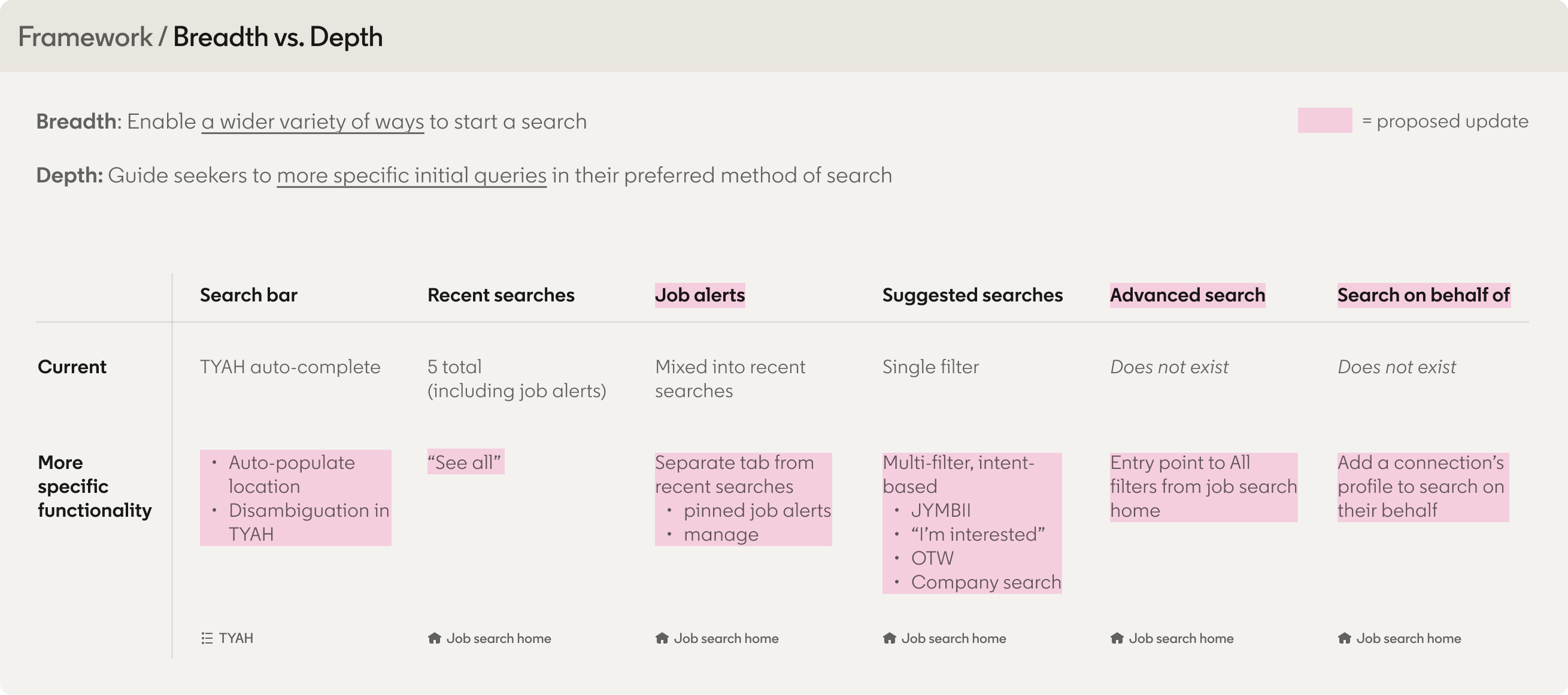 The Breadth-vs-Depth audit: every entry point scored on how many ways it offers to start a search (breadth) and how well it guides a more specific query (depth). Two entry points don't exist yet. TYAH is the search bar's typeahead; JYMBII is Jobs You May Be Interested In; OTW is Open to Work.
What changed. The proposed job search home reorganizes around three intents instead of one undifferentiated list: Continue a search (recent searches and job alerts split apart, each with its own "see all"), Jumpstart your search (companies you're interested in, open-to-work-based, and jobs-you-may-be-interested-in), and Other ways to search (advanced search, ideal company search, search for someone else).
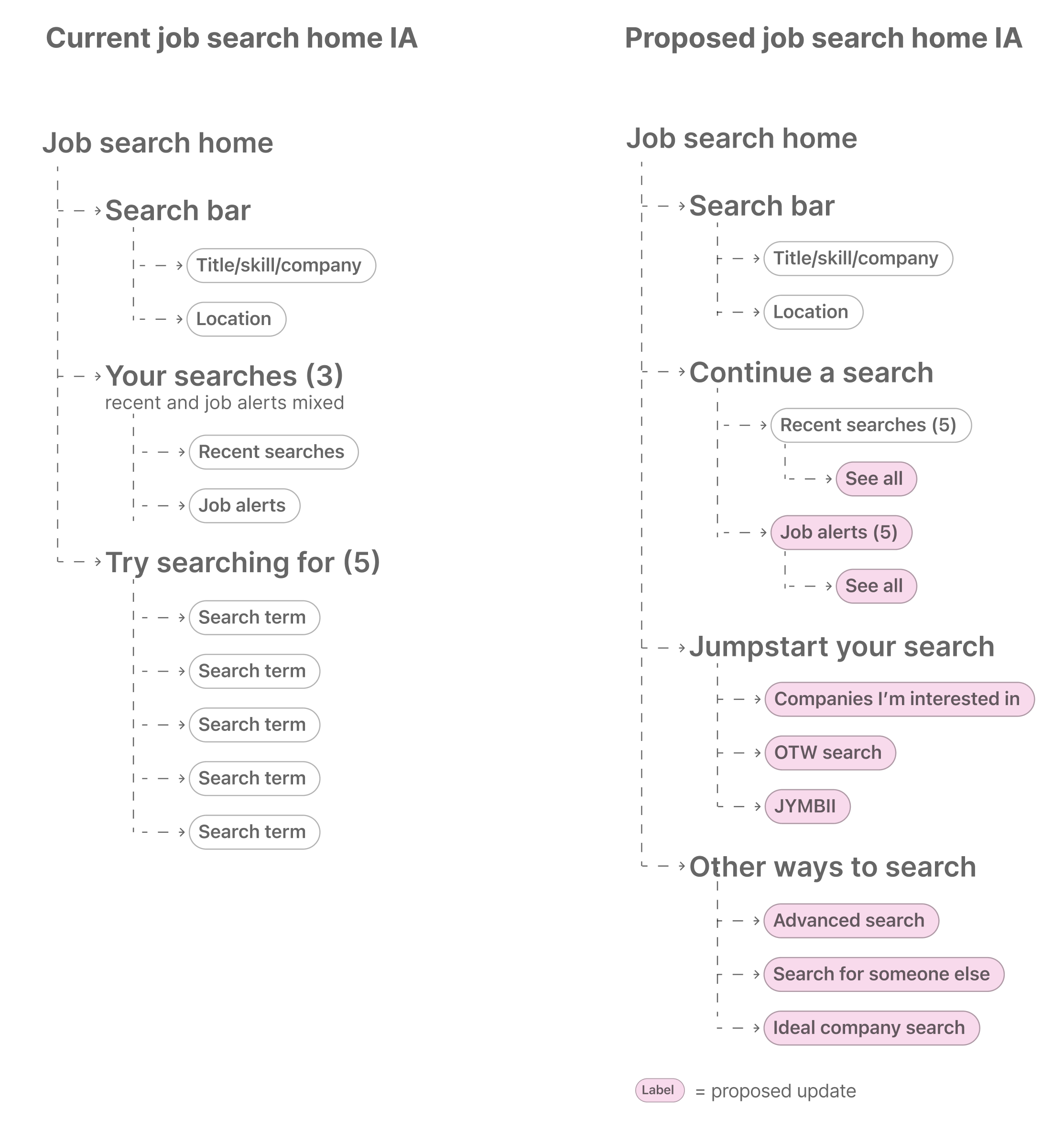 Current job search home IA versus the proposed IA, reorganized around intent: Continue a search, Jumpstart your search, and Other ways to search.
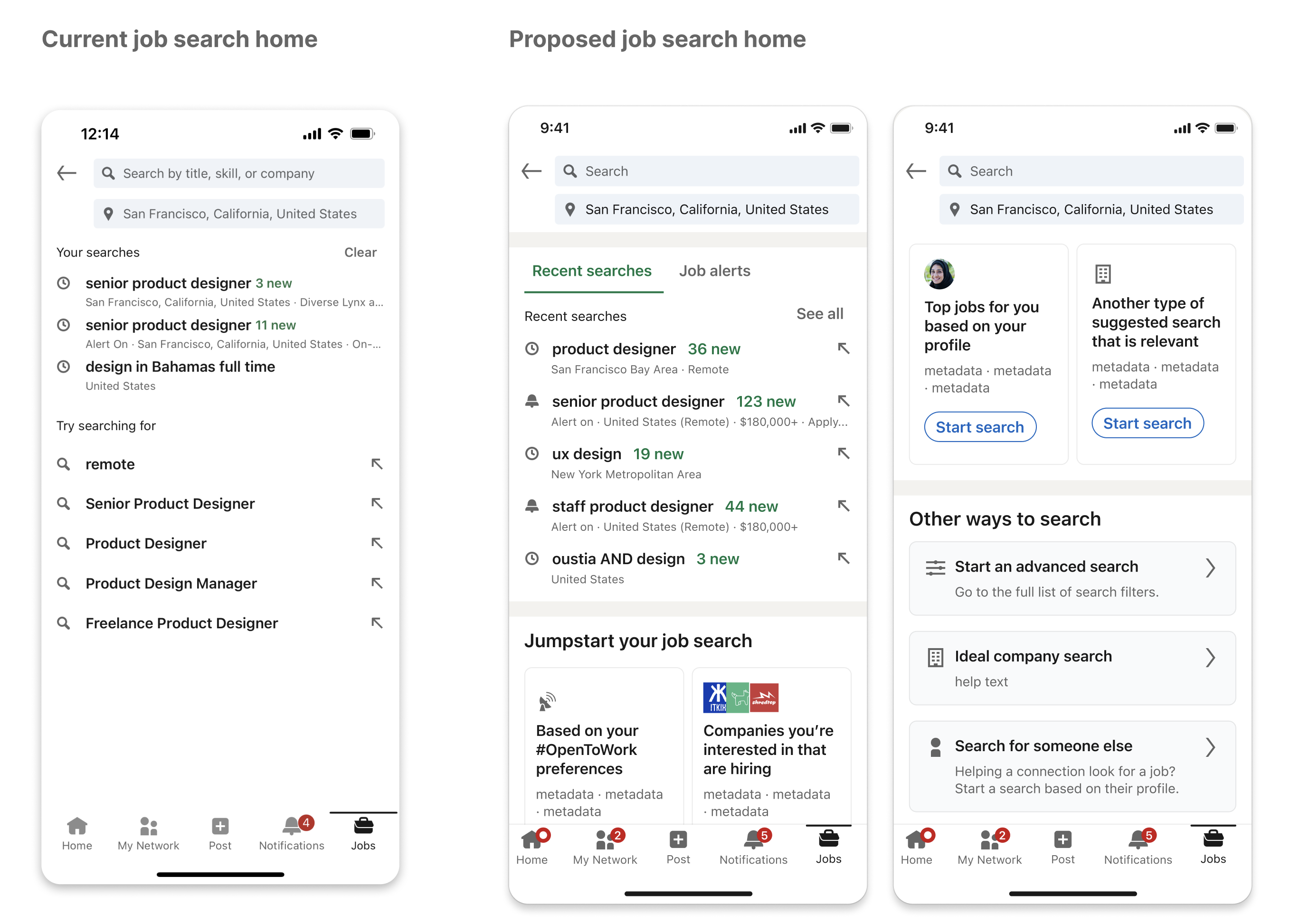 The current job search home beside the two proposed screens.
Designing one of the gaps. Ideal company search was one of the three capabilities seekers described wanting that the product didn't support, so I took it past a label in an IA diagram. Typing into the search bar disambiguates across job titles, skills, and companies rather than assuming every query is a title. Choosing a company opens a company-first view (size, open roles, who you know there), with roles grouped by function and counted, so a seeker who's targeting a company rather than a title starts from the company and narrows inward.
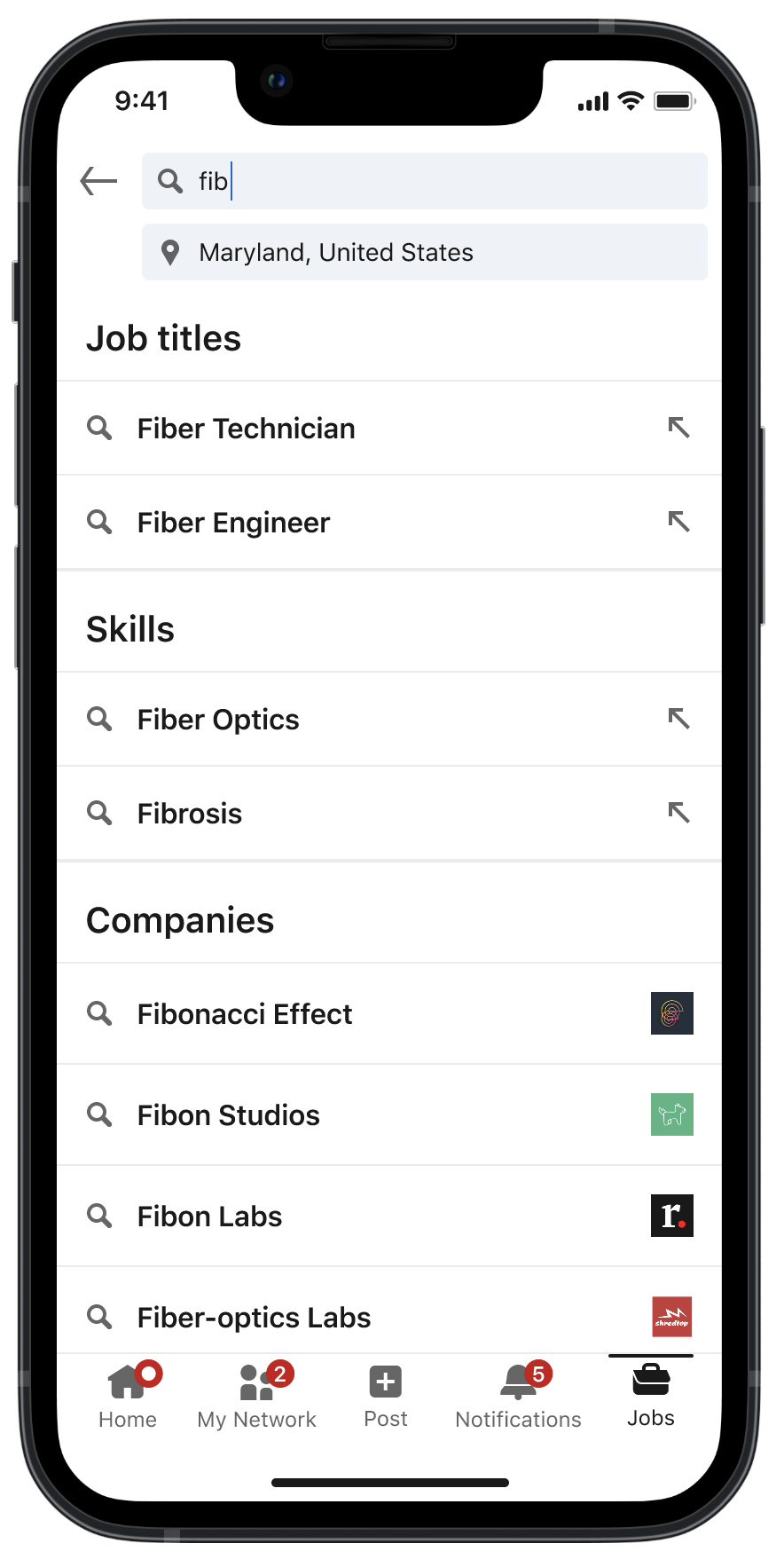 The search bar disambiguates across titles, skills, and companies. Not everything is a title.
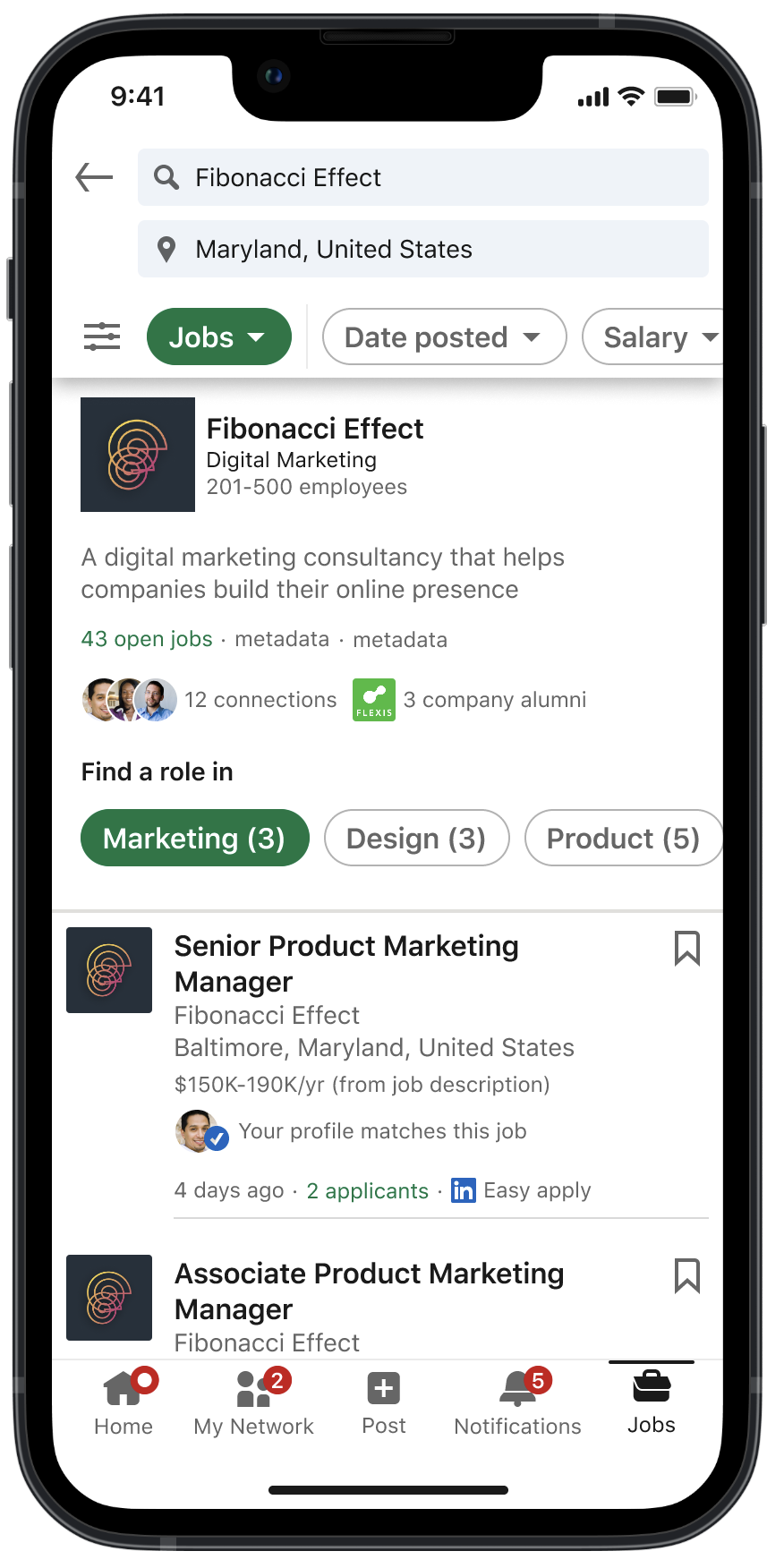 Choosing a company opens a company-first view: roles grouped by function, and who you know there.
Opportunity 2: Refinement
Guidance, not more options
The problem. The same research surfaced three distinct failures in refinement: the filters seekers needed didn't exist, couldn't be found, or couldn't be evaluated: they didn't know which ones would help.
The data made the shape of it clear: among job searches that used filters, 93% used the visible filters and only 7% used the hidden ones. More filters meant more clutter and, if anything, deterred use. Availability was never the constraint. Awareness was.
The framework. It's not enough to make new filters available if seekers don't know about them. I mapped six surfaces (filter bar, All Filters, returning to the search bar, inline, no results, end of results) against four needs: discoverability, comprehension, efficiency, usability. Most of the grid was empty. The current experience offered no filter guidance at any point after the initial bar.
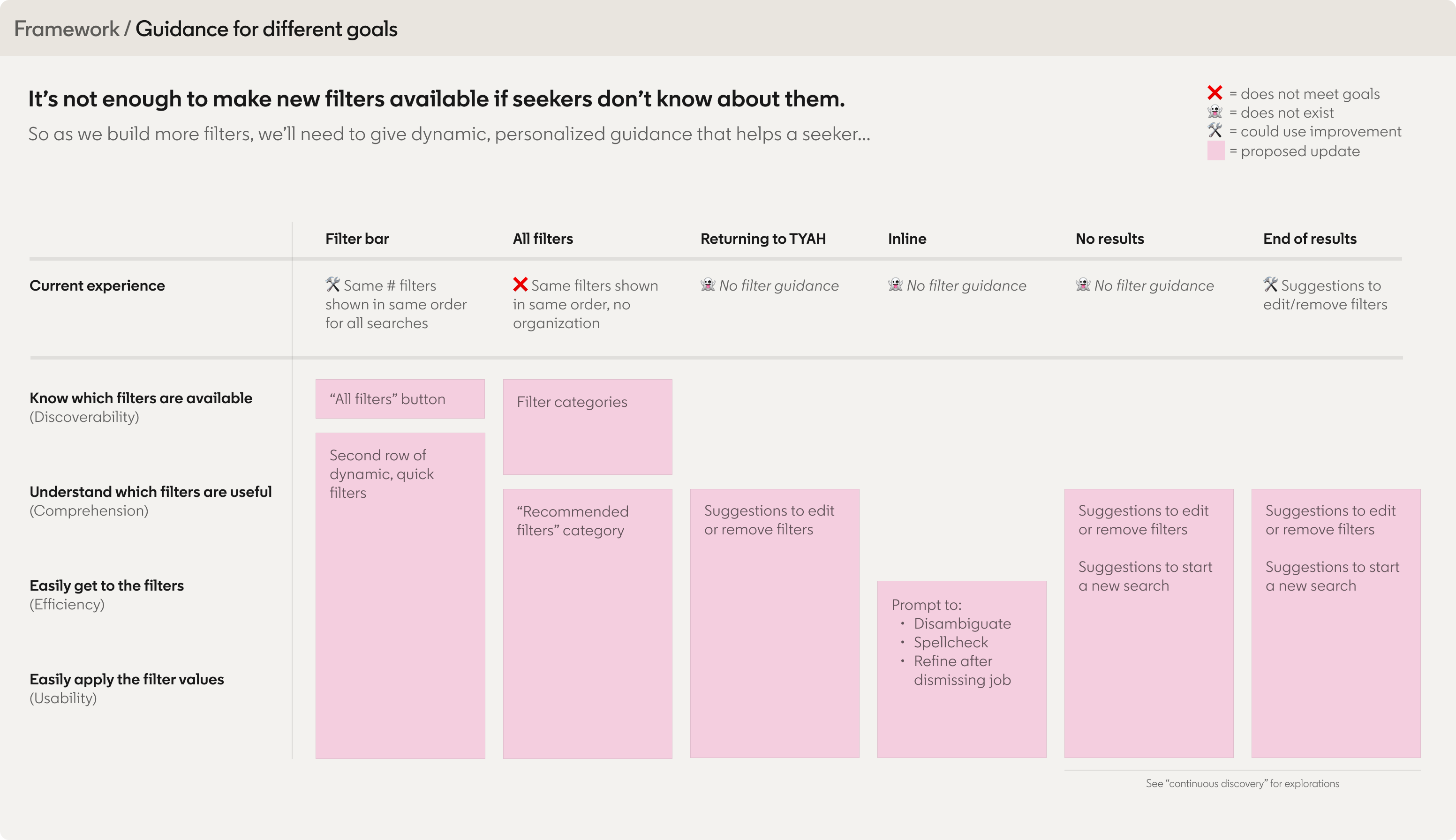 The Guidance-for-Different-Goals map: six filter surfaces against four seeker needs. Most cells are empty in the current experience.
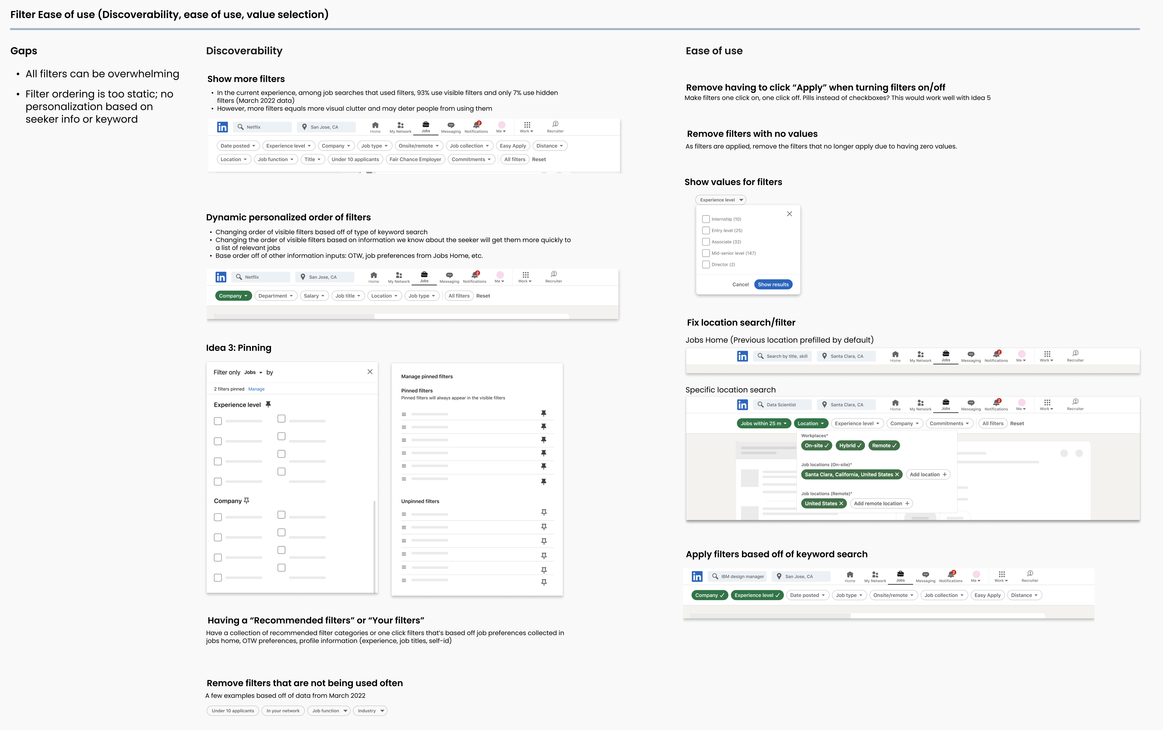 The filter ease-of-use working board: where the gaps are, plus the two ideas that carried forward: dynamic filter ordering and a Recommended filters set. (This is where the 93% / 7% split came from.)
What changed. Two moves. A second row of dynamic filters that surfaces filter values rather than filter categories: one-tap, triggered when a result count is too large, drawn from explicit preferences, inferred behavior, and patterns from similar searches. And a restructured All Filters, moving from one flat list to categories with a Recommended filters set at the top.
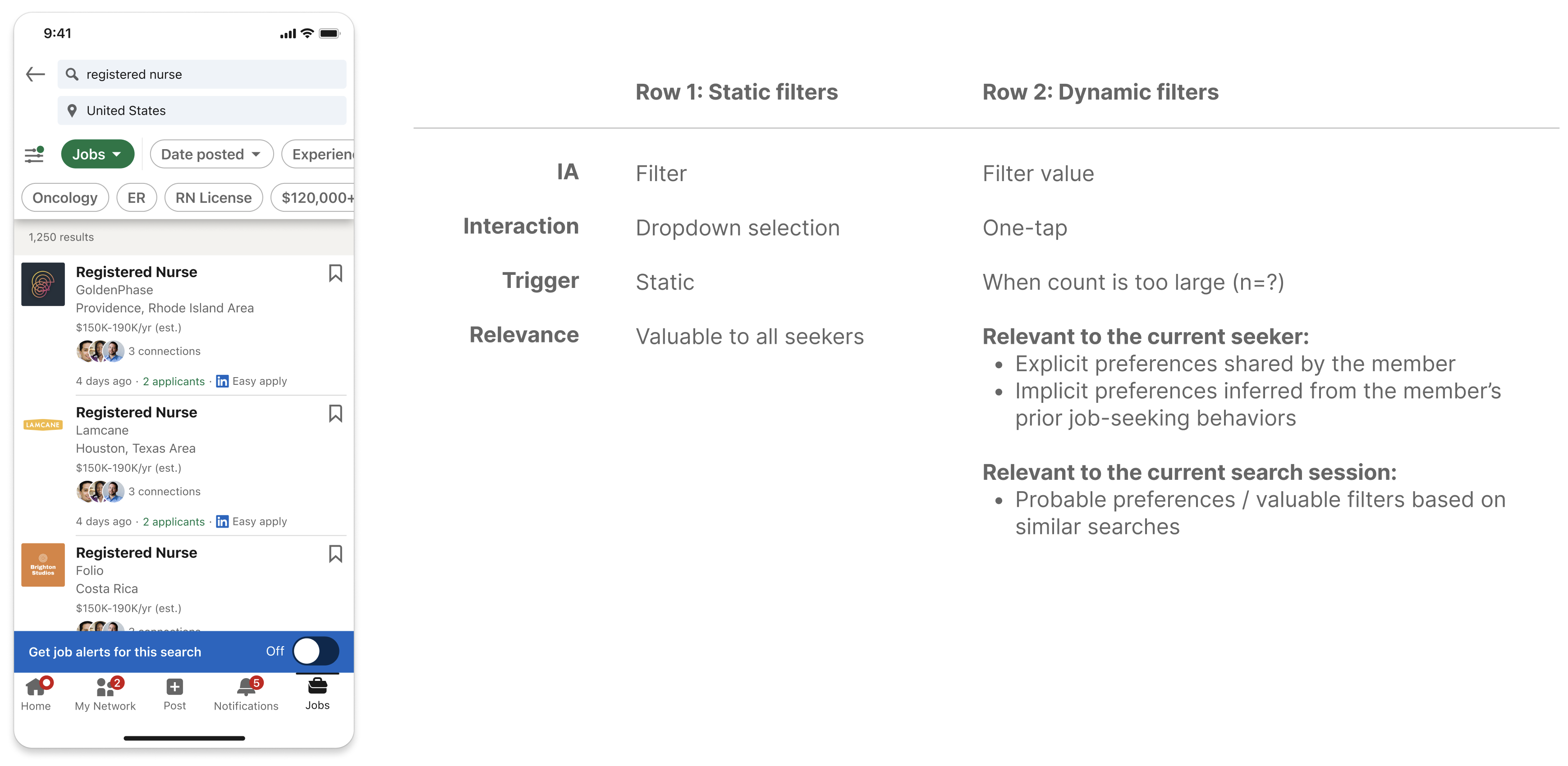 A second row of dynamic filters that surfaces filter values: one-tap, triggered when a result count runs large, drawn from stated preferences, inferred behavior, and similar searches.
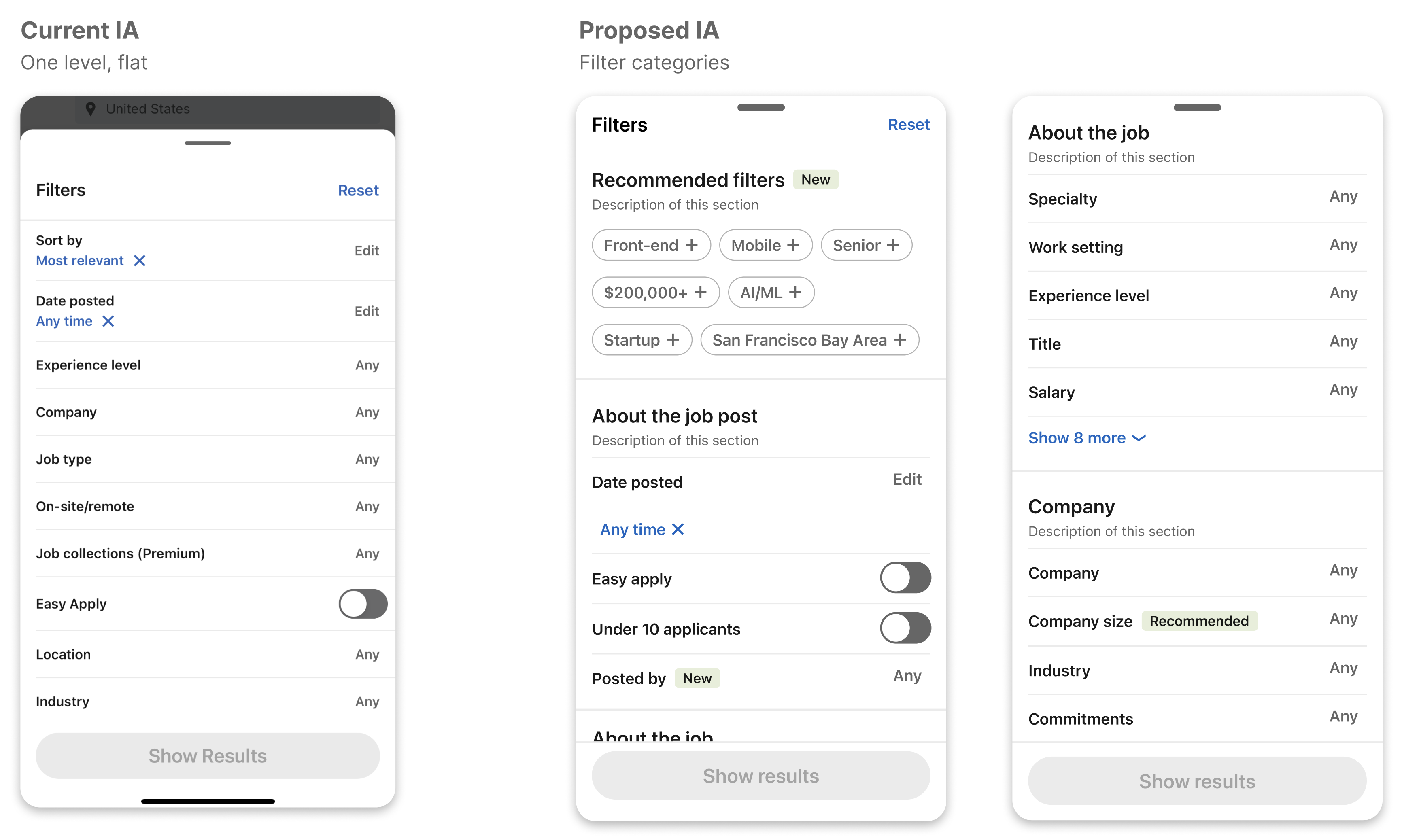 All Filters: the current flat list versus the proposed structure: categories, with a Recommended set at the top.
Opportunity 3: Continuous discovery
All Filters: the current flat list versus the proposed structure: categories, with a Recommended set at the top.
Opportunity 3: Continuous discovery
What the system owes you when it has nothing left
The problem. A seeker reaches the end of results, or gets none at all, and isn't sure what to do next.
This is the failure mode I cared most about. The other two opportunities are about a system that asks too much at the start. This one is about what it does when it's already let someone down. The existing end-of-results screen offered a list of filter edits (remove salary, expand location, clear everything), which puts the repair work back on the seeker at the exact moment they've run out of ideas. The no-results screen offered less: an illustration, "try removing filters or rephrasing your search," and a Clear all filters button.
For someone who needs a job, that's not a neutral empty state. It's the product telling them their search was wrong without telling them what would be right, and it's the point where they leave.
The focus. Avoid dead ends using personalized recommendations based on query and user metadata: show additional job boards with high-fit jobs rather than leaving the seeker with filter edits and their imagination.
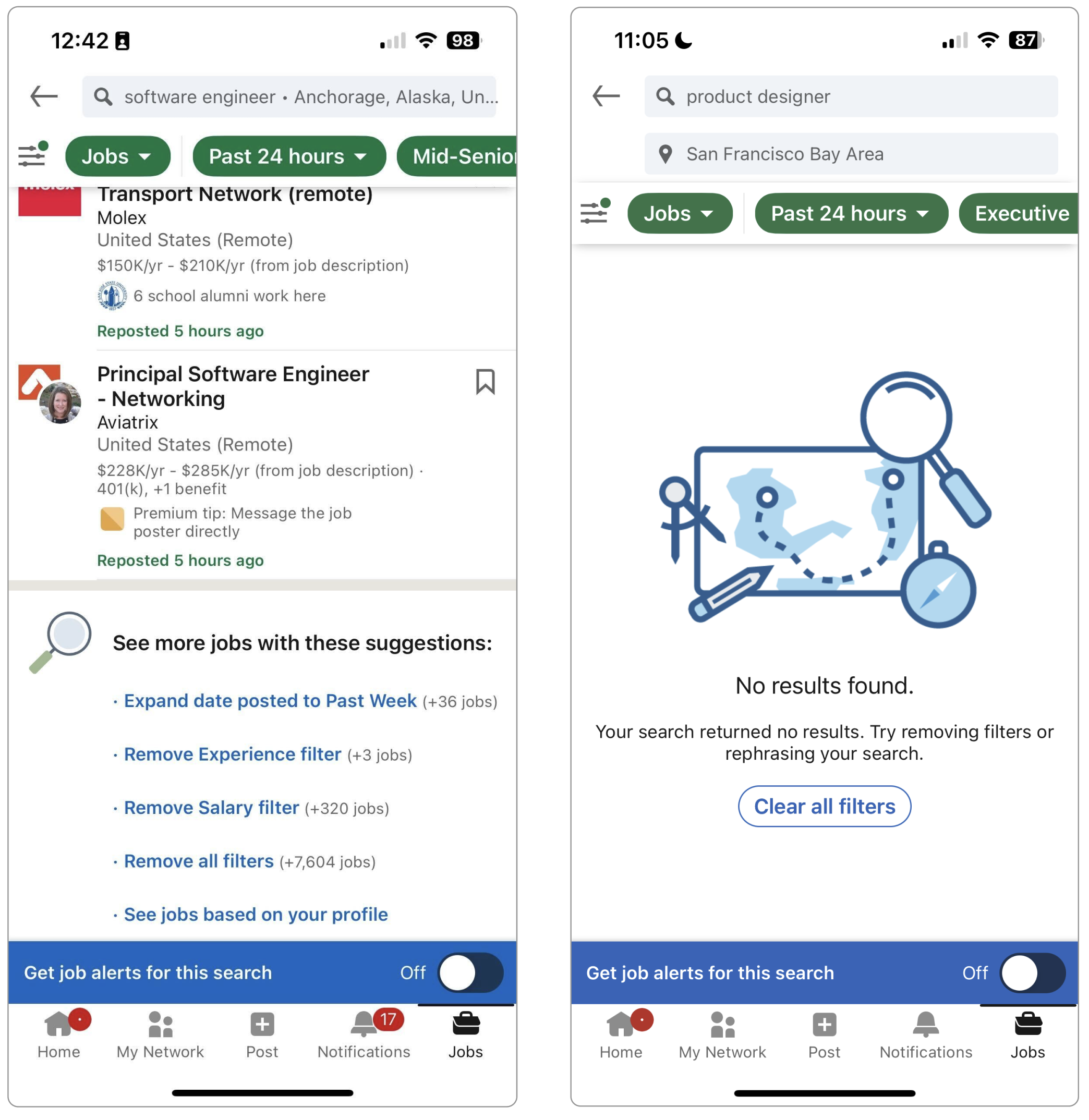 The current end-of-results and no-results screens: a list of filter edits, or an illustration and a Clear all filters button.
What changed. Automatic expansion generates job boards from the search itself (jobs similar to the title searched, similar jobs near the searched location), each with a clear rationale and a path to see more. A parallel set draws on the seeker's stated preferences: other job titles they've listed, other locations they'd accept, remote as a job type. The seeker never lands on nothing.
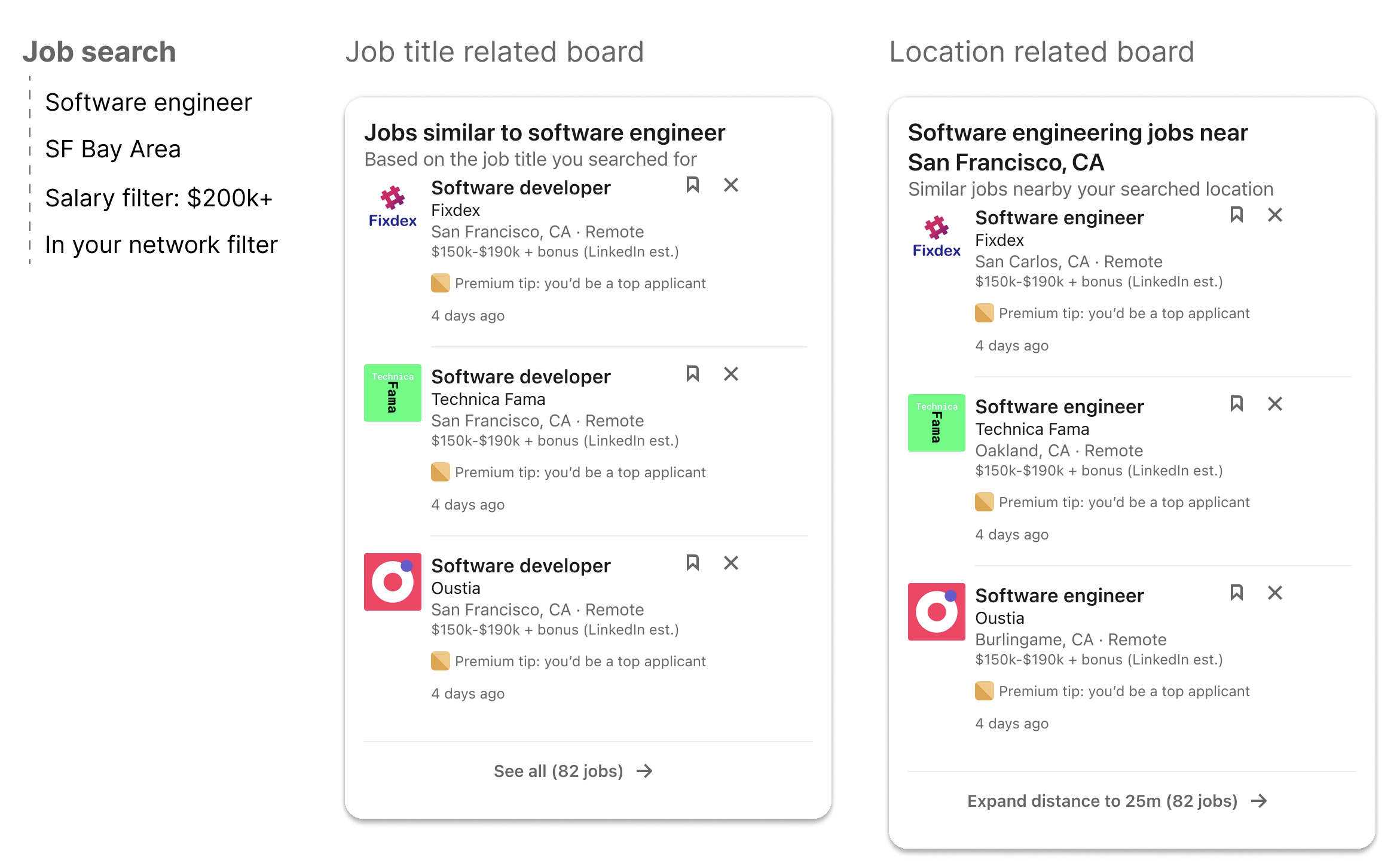
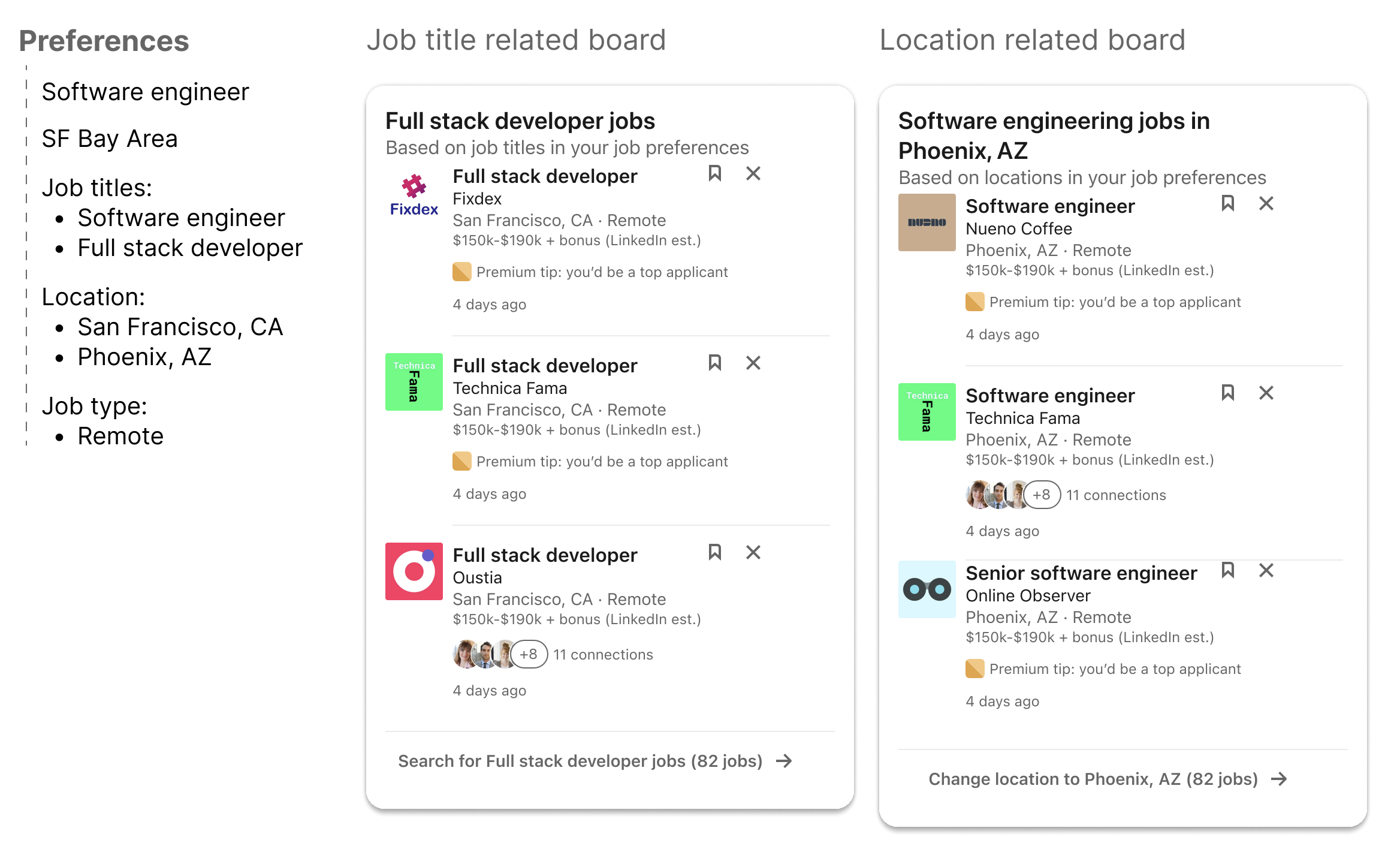 Generated boards give the seeker somewhere to go: one set built from the search itself (similar titles, nearby locations), one from stated preferences (other titles, other locations, remote).
Phased, not all at once. I proposed this in three steps rather than one leap. Phase 1 stays close to the current experience with visual improvements: links that adjust the search parameters and reload results. Phase 2 shows those same adjustments with three-job previews and a link through to the rest. Phase 3 conserves vertical space by moving job cards into horizontal carousels.
A phased rollout: Phase 1 improves the current links in place, Phase 2 adds three-job previews, Phase 3 moves cards into horizontal carousels.
Explorations
Wider than what shipped, and cut down by who owned what
Each opportunity started broader than it ended. What narrowed it was design review and a constraint that shaped the whole vision.
Refinement: the filter ideas that didn't survive. I explored well past what appears in the final direction: negative and exclude filters worked three ways (radio buttons, a dropdown, an inline expand), pinning so a seeker's most-used filters always stayed visible, plus a manage-pinned-filters surface, a set of net-new filters like company size, posted-by, since-your-last-visit, and visa sponsorship, and two changes to the All Filters modal itself: stripping out filters most seekers never touched, and turning more filters into one-tap binary pills.
None of it made the final three opportunities, for two reasons that compounded. The first was pushback in design review. The work was presented up the chain to the senior director of design. The second was organizational: different teams owned different parts of the interface, and any change to the top bar or the filter row triggered eng escalations across those boundaries. A proposal's cost was how many teams had to agree, not just its build.
So the work became finding the compromise: what could meaningfully improve refinement while living inside the surfaces I could actually move. Dynamic filter ordering and recommended filters survived because they change what appears in an existing container rather than restructuring the container itself. That's the version I took forward, not the most ambitious one I drew, but the one that could ship.
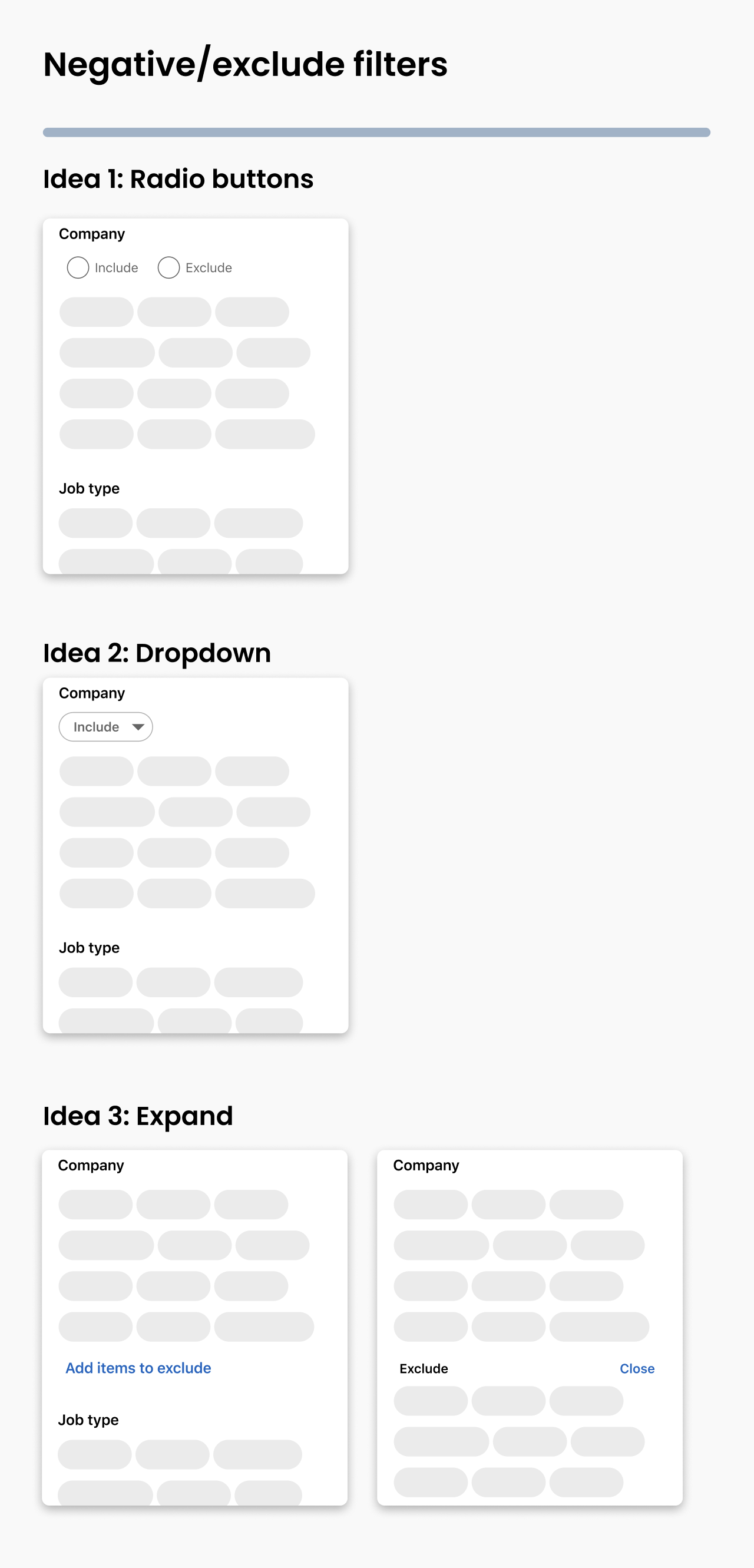 Negative and exclude filters, explored three ways (cut by design review and cross-team ownership).
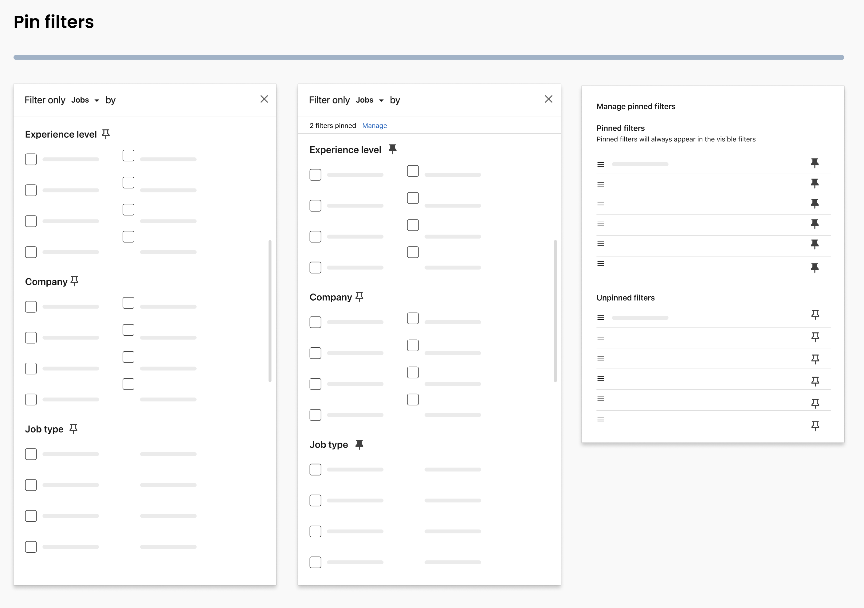 Pinning a seeker's most-used filters so they stay visible (cut by the same design-review and cross-team constraints).
Articulation: the explorations were the wrong shape. For the search-bar empty state I worked through several layouts: different arrangements of recent searches, saved searches, suggested searches, and browse entry points, plus a first-time-user variant and both pill and list treatments for suggestions.
Design review returned two things. First, the space had to earn itself: if the empty state was going to take up that much room, it needed to offer more than a better-arranged version of what was already there. Second, long lists of recent searches were rejected outright: nobody looks back past their last five to seven, so a scrolling archive was solving a problem no one had.
The real finding was that I'd been exploring the wrong variable. Every direction rearranged existing capability. What seekers actually described wanting (surfaced through UXR and PMM discussions, with additions from my PM) wasn't supported at all:
- Starting from the full set of filters rather than running a general search and narrowing afterward
- Searching for jobs at a specific company
- Searching on someone else's behalf without polluting their own recommendations: look for chef roles for a friend, and you don't want chef jobs following you into your feed and your job alert emails
Those three became Advanced search, Ideal company search, and Search for someone else in the proposed IA. They're the reason the Breadth-vs-Depth audit lists two entry points as Does not exist: gaps in what the product could do, not in the layout.
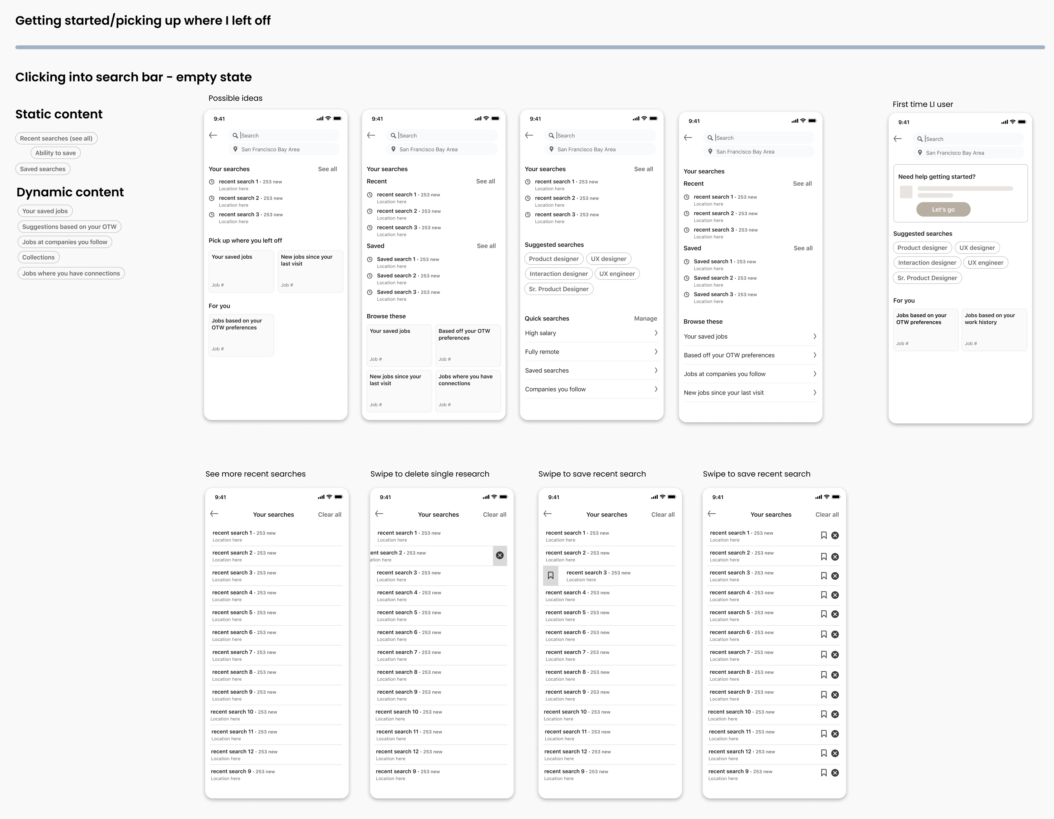 Empty-state layouts for the search bar: all rearrangements of existing capability, which is why review sent them back.
Outcome
Empty-state layouts for the search bar: all rearrangements of existing capability, which is why review sent them back.
Outcome
One of three, and no way to know about the rest
This was a vision, not a launch. Nothing here shipped on my watch, and I have no success metrics to point to. The work was a proof of concept meant to align a team on where job search should go and what steps would get it there.
What I do know: after I left LinkedIn, the continuous discovery direction was released. I can't claim the shipped version as my design, and I don't know how it performed. The other two opportunities, articulation and refinement, I have no visibility into at all.
That's an honest ending for vision work, and it's the part I'd want to be judged on anyway: not whether every direction shipped, but whether the thinking was sound enough that one of them did.
What I took from it
Keep cutting problems down. A vision-sized brief is unmanageable until you break it into smaller pieces. Splitting job search into articulation, refinement, and continuous discovery is what made an ambitious area organized enough to actually design against, and it's what let me show which piece to build first.
Alignment is never overrated. The constraint that shaped this project was organizational: different teams owned different parts of the interface, and the most interesting ideas were the ones that crossed the most boundaries. You're only as good as your relationships with your cross-functional partners, and the version that ships is the one you can get people to agree on.
A vision isn't multiple versions; it's multiple phases. The temptation is to present several competing futures and let the room pick. What actually moves work forward is committing to one or two north-star designs and then showing the steps toward them. Continuous discovery is the direction that shipped, and it's the one I phased.