Overview
The problem
Apply Connect is a LinkedIn integration that recruiting teams switch on inside their applicant tracking system (ATS). During onboarding, a company admin sets up which features are active. Get it right once and every recruiter at the company benefits, so setup is a high-stakes, low-frequency moment: admins rarely return to it, which means whatever they configure tends to stick.
The setup screen wasn't holding up. Admins were turning features off because they couldn't tell what the features were, and they disabled anything unclear.
The opportunity
One of the features admins kept disabling was Applicant Notifications, the setting that tells job seekers when their resume is viewed, downloaded, or their application is rejected. For an applicant, that notification is often the only signal they get during a hiring process. When an admin switched it off by mistake, the applicant was left in silence at the most anxious point of a job search, and neither party chose that outcome.
The brief: make setup impossible to get wrong in a way that quietly harms someone the admin never sees.
Recruiter / Admin
→
Configures which features are on
→
Sets Applicant Notifications
decides what the applicant hears
↓
Applicant
→
Applies without leaving LinkedIn
→
Gets told their status, or hears nothing
How Apply Connect works on both sides: the admin sets it up, the applicant lives with the result. The link between them is Applicant Notifications: on, and the job seeker hears back; off, and they wait in silence.
Research insight
Confused users don't ask questions; they opt out
The signal came from two directions. PMM and BizOps pulled the data on how many admins had Applicant Notifications turned off. PM interviewed customer admins about why they weren't using features they'd asked for.
The answer was consistent and a little damning: setup and the overall experience were confusing, so admins defaulted to turning off anything they didn't understand. Because they couldn't parse the feature, they often didn't realize they were disabling the very feature they wanted.
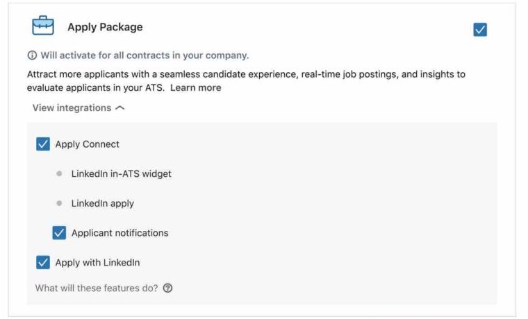
The specific culprit surfaced fast: the screen leaned on nested checkboxes that did double duty: a checkbox was both the control to activate a package and the indicator of its status. That breaks a basic expectation of how a checkbox behaves, and once the hierarchy of what-includes-what got tangled in it, admins couldn't tell what they were switching on or off.
 1
2
3
1
2
3
The original setup screen.
- One checkbox both turns the package on and shows that it's on.
- Applicant notifications is nested inside Apply Connect, next to items that have no checkbox at all.
- What each feature does is only shown on hover.
How might we
How might we make setup legible enough that an admin never disables a feature they actually want, especially one a job seeker depends on?
Approach
Simplify the model, don't just relabel it
The temptation with a confusing screen is to add explanation on top of it. I treated that as the trap. The screen was structurally overloaded: one control carrying two meanings, and a feature hierarchy that didn't read. The fix had to reduce what the admin had to decode, not add more for them to read.
- One control, one meaning.A checkbox should do one job. Activation and status shouldn't share a widget.
- Descriptions where decisions happen.If an admin has to hover or click to learn what a feature does, most won't, and they'll guess. Put the information next to the choice.
Explorations
What I tried and left behind
I didn't land on the answer first. A few directions got built and rejected:
- Merging auto-included and configurable items into shared sections.The idea was fewer sections. In practice, grouping them together looked like they were related in a way that mattered, so admins treated them as one control, which meant they couldn't parse what was automatic versus what was a choice. A lateral move, not a simplification.
- Multiple ways of surfacing descriptions, including tooltips.Users were clear in testing: they didn't want to hover or click to find out what a feature did. They wanted the descriptions visible. The tooltip pattern, which the original relied on, was the thing to remove, not refine.
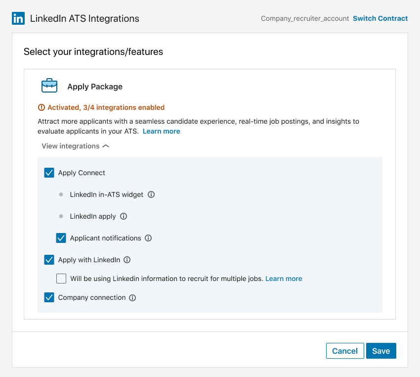 Rejected: one merged section with info-icon tooltips. Grouping everything together made the automatic and the configurable read as a single control.
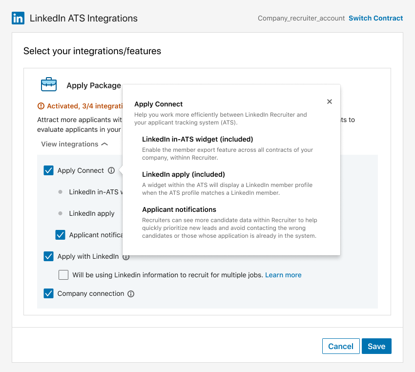 Same direction, tooltip open. In testing, admins were clear they didn't want to hover or click to find out what a feature did.
Each rejected direction pointed at the same root cause: the nested checkboxes and hidden descriptions were the disease. Anything that kept them was treating symptoms.
Final solution
Give every feature its own space, and nothing to decode
The final design broke the tangled list apart by giving each integration its own self-contained card. Cards are a learned pattern for "independent, configurable thing" (admins already recognize that gesture), so the hierarchy became legible at a glance. Each card contained:
- A single, clear control.Activation separated from status, so a checkbox meant one thing again.
- Descriptions always visible.Sitting right next to the feature they described, no hover, no tooltip, no guessing.
- Clear separation of automatic vs. configurable.What's automatically included is set apart from what's a choice, so the hierarchy reads at a glance.
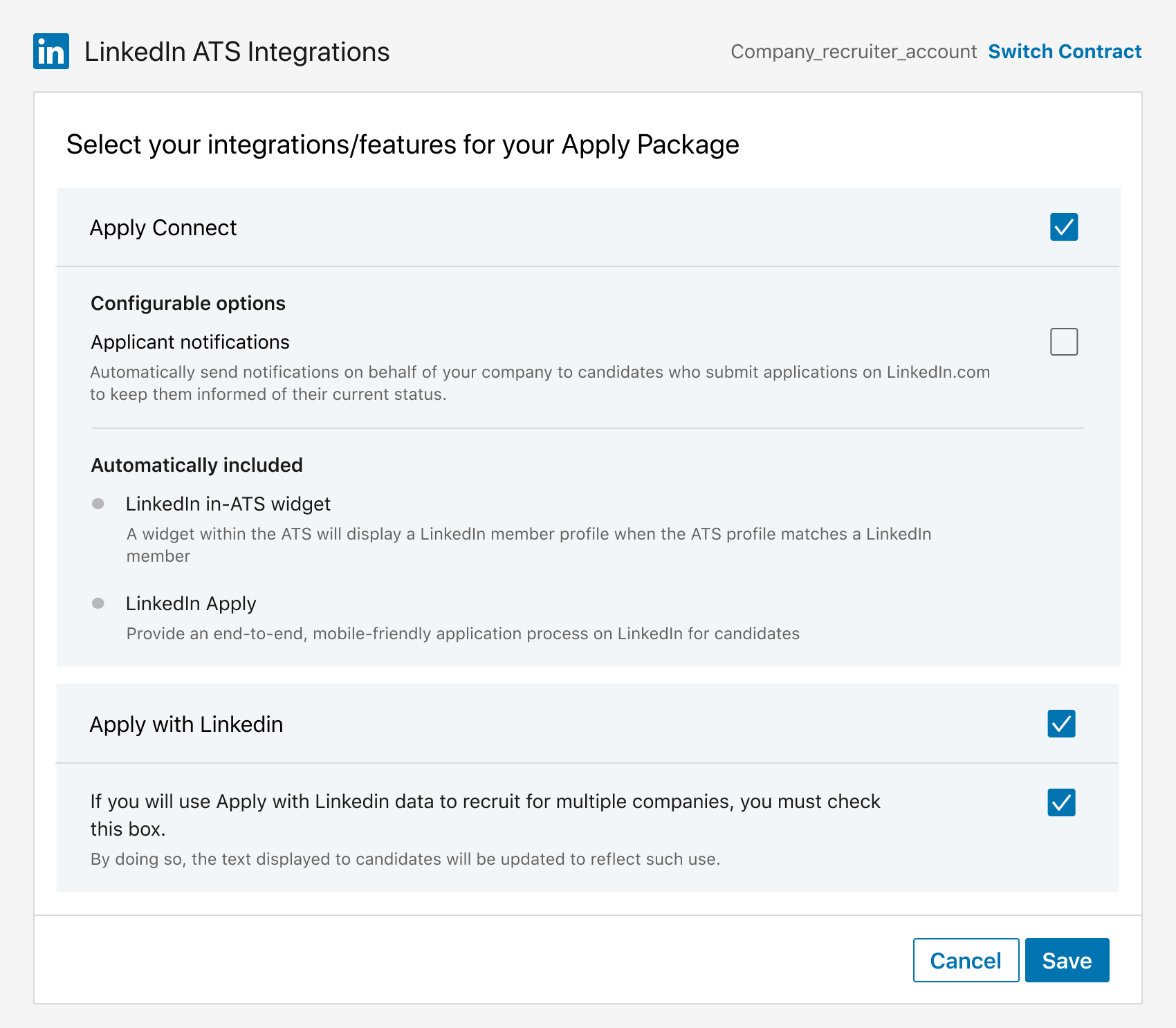 The redesigned configuration modal. One control per decision, "Configurable" separated from "Automatically included," and every description visible in place.
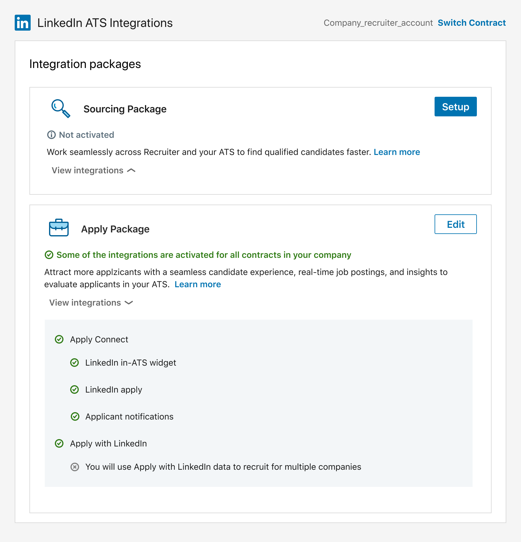 The resulting status view: an admin can see at a glance exactly what's on, without decoding a checkbox.
The result was a setup flow an admin could get right on the first pass, which mattered precisely because they'd likely never revisit it.
 The redesigned setup, end to end: card overview, configuration, and a status an admin can actually read at a glance.
Outcome
The redesigned setup, end to end: card overview, configuration, and a status an admin can actually read at a glance.
Outcome
A legible setup, a protected applicant
The redesign removed a failure mode where a confused admin's choice silently harmed someone they never saw: the job seeker waiting in silence. Setup became legible enough to get right the first time, which mattered precisely because admins rarely revisited it.
After launch, I reviewed the new setup with recruiters. Their feedback was positive: they understood what each feature did and what they needed to do to set it up.