Overview
The problem
LinkedIn's job search experience was built around a single mental model: the active searcher. Someone who knows exactly what they want (a specific role, company, industry) and types it into a search box with filters. The platform was very good at serving that person.
But a large share of job seekers don't operate that way. They're casually or passively looking, open to opportunity, thinking in themes rather than keywords: what companies are growing, what roles offer flexibility, what industries align with what they care about. For them, a blank search box is the wrong starting point. They don't have a keyword ready; they have an interest. Faced with a system that only rewards precise queries, they either force their curiosity into a search term or leave.
The opportunity
The system was optimized for one segment and underserved everyone else by default. These weren't people who didn't want to find jobs. They were people whose way of discovering didn't fit the search model, and nothing on the page met them where they were.
The brief: build a second, parallel entry point into job search: one organized around what people value, not what they can name in a search box.
Research insight
Job seekers segment by how they think, not just what they want
Two rounds of testing made the segmentation unmistakable.
Round one put the concept in front of 222 participants (99 active seekers, 123 casual and passive). Round two went deeper: 20 moderated 1:1 sessions across a mix of job-seeking urgency, industries, and career stages, using real LinkedIn data so participants clicked into collections and saw genuinely relevant jobs.
The split was clean:
Active Seekers took a laser-focused search approach. They knew their target and treated anything that slowed them down as friction. Several viewed collections as redundant to the search they already relied on.
Casual Seekers and Career Starters had the strongest positive reaction. They were open to inspiration, discovering companies, jobs, and values they hadn't previously considered. Collections matched how they were already thinking.
Most casual seekers weren't frustrated by search. They weren't aware there was anything missing. They simply had no reason to come to LinkedIn's jobs experience, so they didn't. Collections gave them a reason.
Across segments, 96% said they'd want to browse collections alongside keyword search and filters.
- 83% of job seekers feel positive about the “job collections” feature, and 95% see value in it across segments.
- 70%+ say the value of job collections is helping them discover and consider applying to jobs they previously wouldn’t have.
- The top “must have” job collection themes across segments were Activity/Profile, Industry, and Benefits.
Second-round findings: the value of collections concentrated in the browse-oriented segments.
How might we
How might we let job seekers discover opportunities through what they care about (company stage, work style, industry, values) instead of requiring a keyword first?
Approach
Design for the segment the system optimized away
The framework was built on understanding what actually drives a casual seeker's interest. Three lenses shaped every collection:
- AspirationsWhat matters to the seeker: flexibility, growth, mission, company stage. Collections are organized around these, not around job titles.
- AssetsWhat a seeker can use to their advantage: their network, their background, the kind of company where their profile stands out. Collections surface where a seeker has an edge.
- Market realityWhat the market is actually offering right now. Collections reflect real, available opportunity, not aspirational categories with nothing behind them.
Built against those three lenses, a collection becomes a legitimate way in: a seeker browses by what they value, lands in a themed set of real jobs, and explores from there, no keyword required to start.
Explorations
Figuring out what a collection even was
The first design work came before either round of testing: settling what a collection actually was: how deep the structure should go, and how it should speak. Both got worked through in design reviews before the shape held.
Structure: how deep should the hierarchy go? Early on I explored a fuller taxonomy: browse sections → collections → job list. It organized cleanly, but it buried the jobs under layers, and I concluded it was too complicated for a surface whose whole point was low effort. I took it into design review with the PM and the other designers to check the call, and it held. So I cut a level out. What shipped is flatter: collections sit right on the Jobs tab, and a tap opens the job list inside.
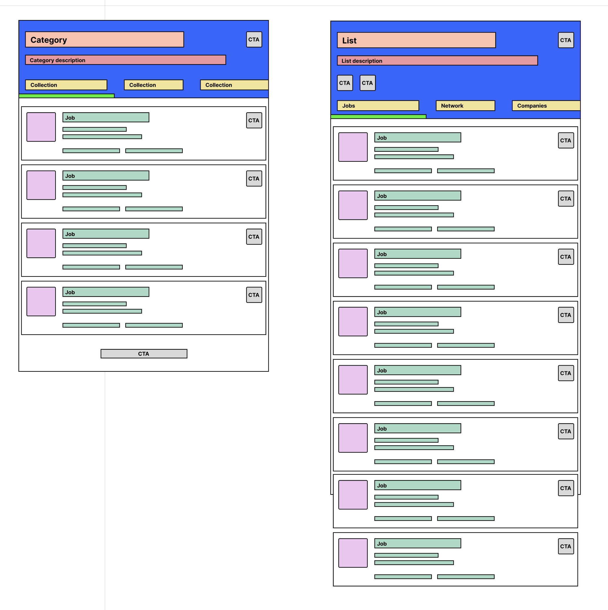 Two ways to organize a collection: a nested, multi-level taxonomy versus a flatter view.
Tone: how should a collection speak? A collection lives or dies on whether its label makes someone curious, so the same collection got written more than one way: one voice more playful (“Your chance to ride with the unicorns”), one more straightforward (“Work for a unicorn company”). I worked this through with the content designers, who tested the variants and came back with a recommendation. The shipped collections landed on the plainer end, and the exercise set the content bar: warm and human, never cute at the expense of clarity.
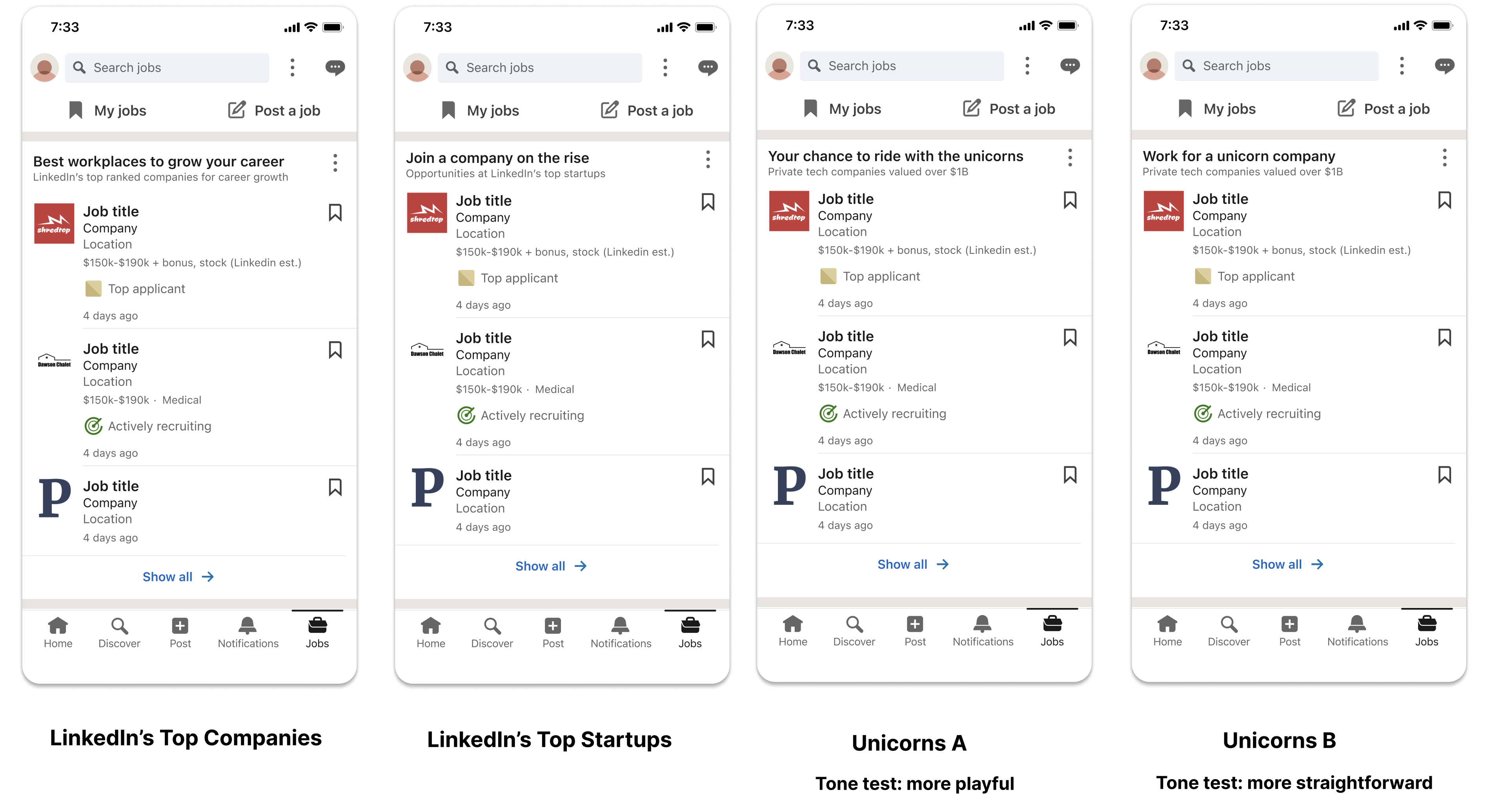 The same collection, two voices: testing how much personality invited a browse without tipping into gimmick.
Both came down to the same thing: fewer layers between a seeker and a real job, and plain labels.
Testing sharpened the execution
Round one validated the concept but flagged a real problem: the visuals were overloaded. Casual seekers liked the idea but found the first execution busy: too much illustration, too many layers competing with the content.
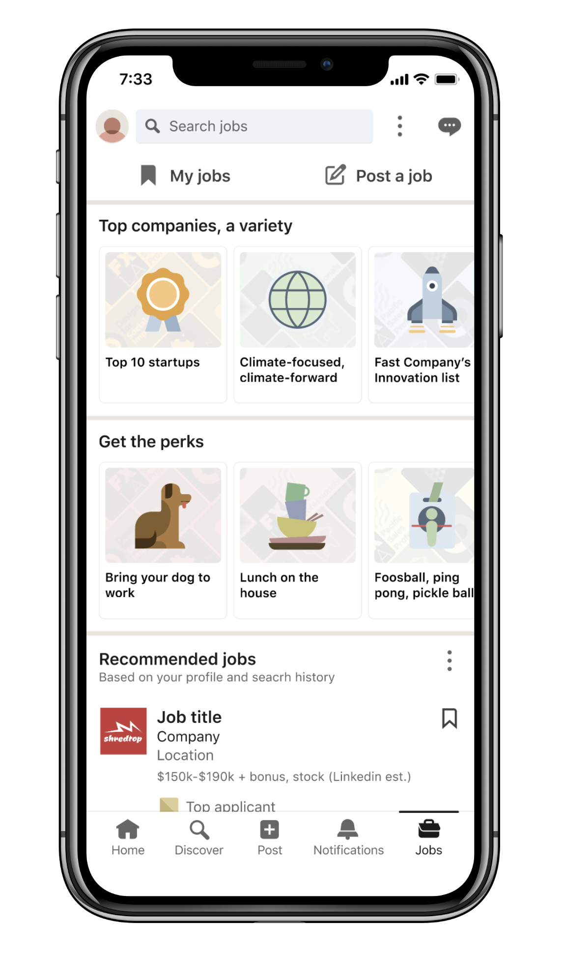 V1: collections as large illustrated cards on the Jobs home.
The next pass added a live job count to each collection, so someone browsing could see real, available roles sat behind the theme rather than an aspirational label. The visuals didn't fully settle until the final design, which replaced the illustrated cards with simpler icons so each collection's theme and job count read first.
Final solution
A second door on the Jobs tab
Collections shipped as the "Explore with job collections" card on the Jobs tab: a browseable row of themed collections sitting alongside search, not replacing it. A casual seeker scrolling their Jobs home now has an entry point that speaks their language.
Tapping a collection opens its leaf page: a focused view of the real jobs within that theme (e.g., "Top Startups," "Unicorns," "4-day work week"), each with a clear label, a scannable icon, and a live job count.
The design's job was to make browsing a first-class way to look for work, so a seeker who arrives with an interest rather than a keyword still has somewhere to go.
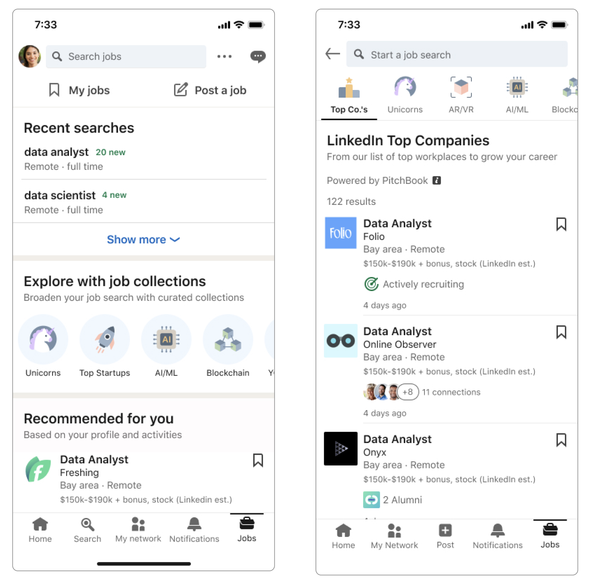 Shipped: the "Explore with job collections" card on the Jobs tab, and a collection leaf page of real jobs within a theme.
Outcome
Shipped: the "Explore with job collections" card on the Jobs tab, and a collection leaf page of real jobs within a theme.
Outcome
Results after launch
Collections launched, and the engagement showed up in the aggregate: jobs viewed rose 24% in sessions where collections were used. Research had predicted where that interest would concentrate: casual seekers and career starters, the group the search-only experience gave no reason to open. I don't have segment-level data on the lift to confirm it.
- +24% jobs viewedwhen collections are used in a session
- +1.44% increase in qualified applicationsfrom users who browse collections
The browse-oriented segment was the one the search-only experience gave no reason to open. Collections gave them one.
That's the systems lesson I keep coming back to: the most obvious users and their use cases can't be the only ones you design for. The active searcher was already well served. The opportunity was in the segment the system had optimized away, and in giving them a reason to show up.